Today, the roads of the United Kingdom are positively littered with road signs. You can't travel the length of even a short back lane or street without encountering colourful metal plates mounted on poles. They're needed for all sorts of things, from offering directions and warnings of hidden dangers to issuing instructions and explaining rules.
It might be hard to imagine now, but there was a time when things were much simpler. In the early twentieth century, there was no standardised pattern for road signs at all, and where signs existed they were usually wooden boards or cast metal with embossed lettering that was then painted. No two were alike.
One five-page typewritten document changed all that. A memorandum issued by the Ministry of Transport in 1920 introduced the concept of standardised, uniform road signs — and a whole lot more.
All change: the new Ministry
In May 1919, Eric Campbell Geddes was appointed Minister of Transport, a title that had never existed before. He became head of a brand new Ministry, overseeing roads, railways, canals and the new business of aviation.
His highways staff took over from an older government body called the Road Board. It had been collecting funds from a tax on road vehicles, but hadn't always been very good at spending it to the best possible effect. With no reliable information about how the roads were being used, the Board tended to avoid improvement schemes and confined itself to providing hard surfaces on as many miles of road as possible. That was incredibly valuable work, no doubt, rescuing motorists from gravel and mud wherever they went, but the Board never did much to improve the safety of the road network or develop its usefulness.
Geddes' new Ministry — ably led by highways expert Sir Henry Maybury — wanted that to change. It instituted classification, a process that would give it accurate traffic counts so it could plan improvement work and establish road numbering. It also started thinking about what could be done to make roads more safe, useful and navigable.
The County Councils Association and the Association of Municipal Corporations had drawn up the only previous guidance on the subject of road signs in 1904. It was only ever a recommendation and it said very little:
- Speed limit. For 10 mile or lower limit of speed, a white ring 18 inches in diameter, with a plate below giving the limit in figures.
- Prohibition. ...a solid red disc, 18 inches in diameter.
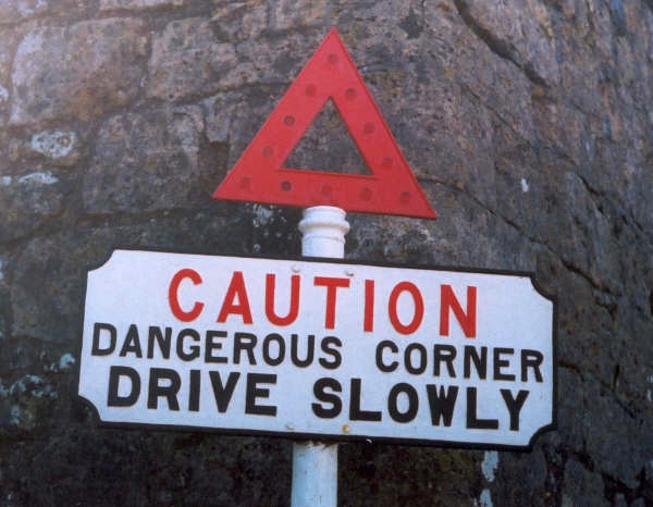
- Caution. For caution (dangerous corners, cross roads or precipitous places) a hollow red equilateral triangle with 18 inch sides.
- Other notices. All other notices under the Act to be on diamond shaped boards.
In the years that followed, some authorities chose to continue making each sign up as they pleased, while the automobile clubs put up their own signs here and there, bound by no rules at all.
Traffic was growing rapidly in both volume and speed, and Maybury considered it essential that signs should be standardised to ensure they were fit for purpose.
A fresh face
Sir Henry's report, published and circulated to the Minister and others in November 1920, was the result of an expert committee of County and Borough Engineers he assembled. It took into account feedback and suggestions from a range of other interested parties, including automobile clubs and trade associations. It was then approved at a meeting of the County Surveyors' Society.
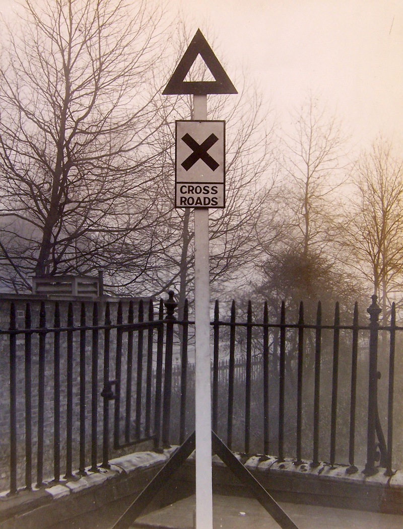
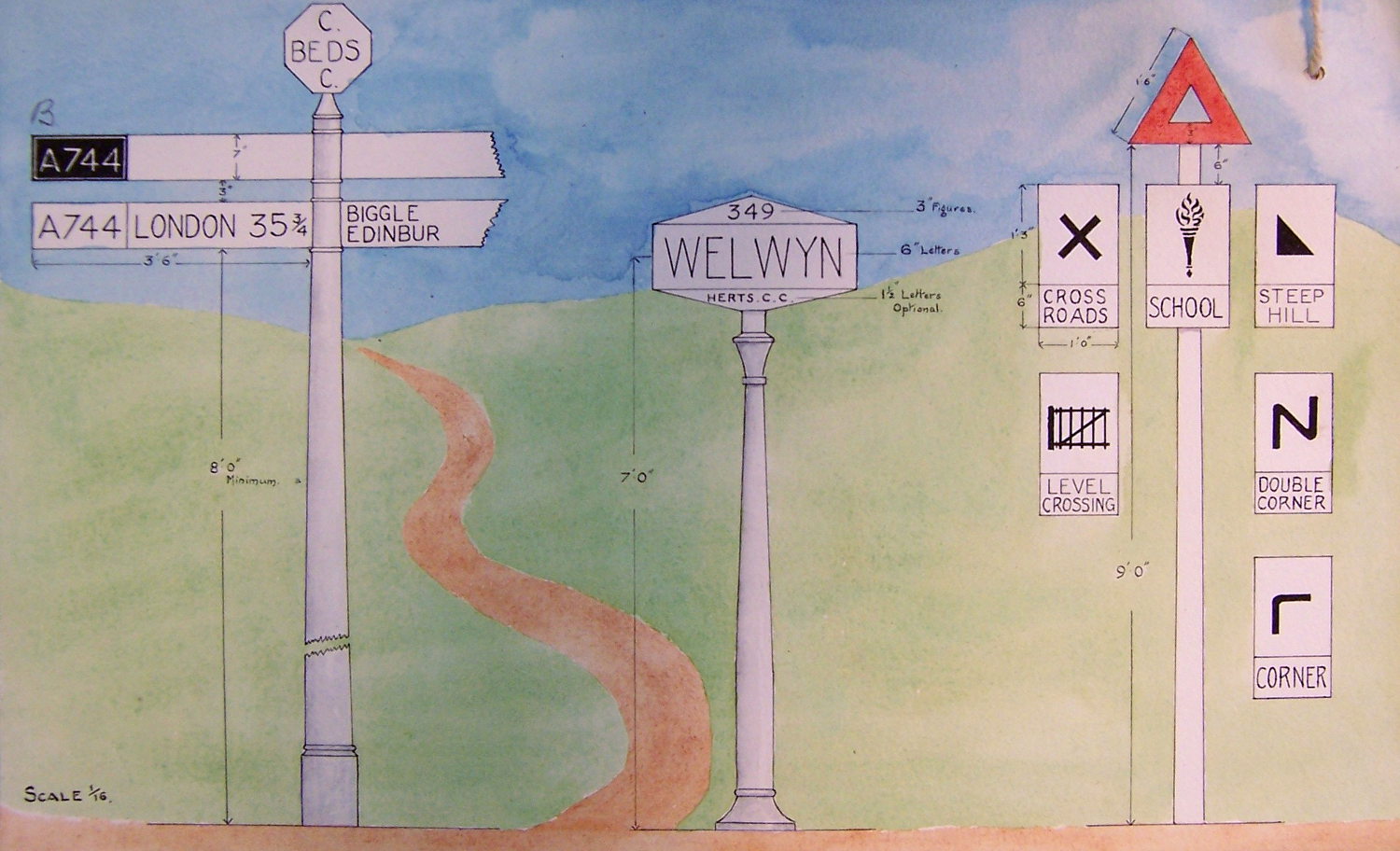
At first sight, the Ministry's new standard was the same as the 1904 specification: it retained the pattern of mounting a shaped finial at the top of the sign post to indicate the type of sign, and a plate underneath with the message on it. The shapes themselves were the same too — a white ring for speed limits, a red disc for prohibitions, and a red triangle for "cautions" — or warnings, as they would now be known.
The key development was on the plates that would be mounted under those shapes, with rules about how high they should be mounted, how the text should be written and — innovatively — a new system for relaying warnings.
"...the special danger to be guarded against shall be indicated by means of a clear and legible symbol, based upon the international symbols as far as applicable, together with a clear and simple title in letters 2 inches high, upon a vertical plate 12 inches wide and 21 inches long to be attached to the post below the danger sign...
The new system required not just an explanation of the danger ahead — none having been considered necessary before — but also a picture or symbol to represent it, inspired by symbols already being tried out in other European countries.
What was truly revolutionary was Maybury's insistence that the symbol would from now on "be regarded as the principal means of indicating the nature of the danger". He was before his time. Nearly half a century later, the Worboys report met controversy for suggesting that symbols were the best way to relay key warnings to drivers, as though they were the first to think of it.
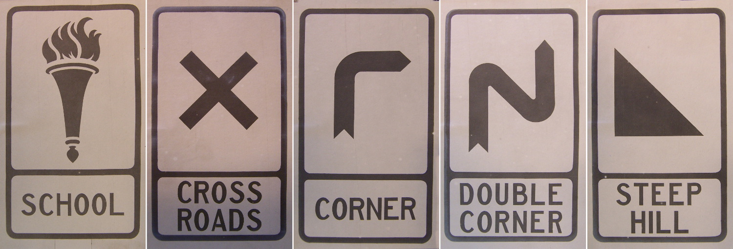
A total of six pictograms were drawn up to represent the six types of danger the pioneering motorist of the 1920s might face: "school", "level crossing", "cross roads", "corner", "double corner" and "steep hill". The only slightly confusing matter was the choice of symbol to represent a school, which was the torch of education.
The 1920 report also set out, for the first time, a standard design for direction signs of a type we'd now call fingerposts. Maybury's standard design was very prescriptive and, for its time, remarkably stark and lacking in ornamentation.
| Height of arms from ground | Minimum 8 feet, maximum 9 feet |
|---|---|
| Length of arm, including route number | Minimum 3ft 6in |
| Depth of arm | Minimum 7 inches |
| Separation between arms | Minimum 3 inches |
| Lettering, raised black block letters on a white ground | For single line 3 inch letters, for double line 2½ inch letters |
| Post | Painted, plain white |
| Route numbers | 4in raised block figures in panel at end of arms |
| Precedence of routes | Lower pair of arms indicate the more important road |
There were further rules about an indication of ownership being placed on the top of the post, mileages being given in numerals only with no fractions lower than a quarter, placement and visibility, and how to measure distances.
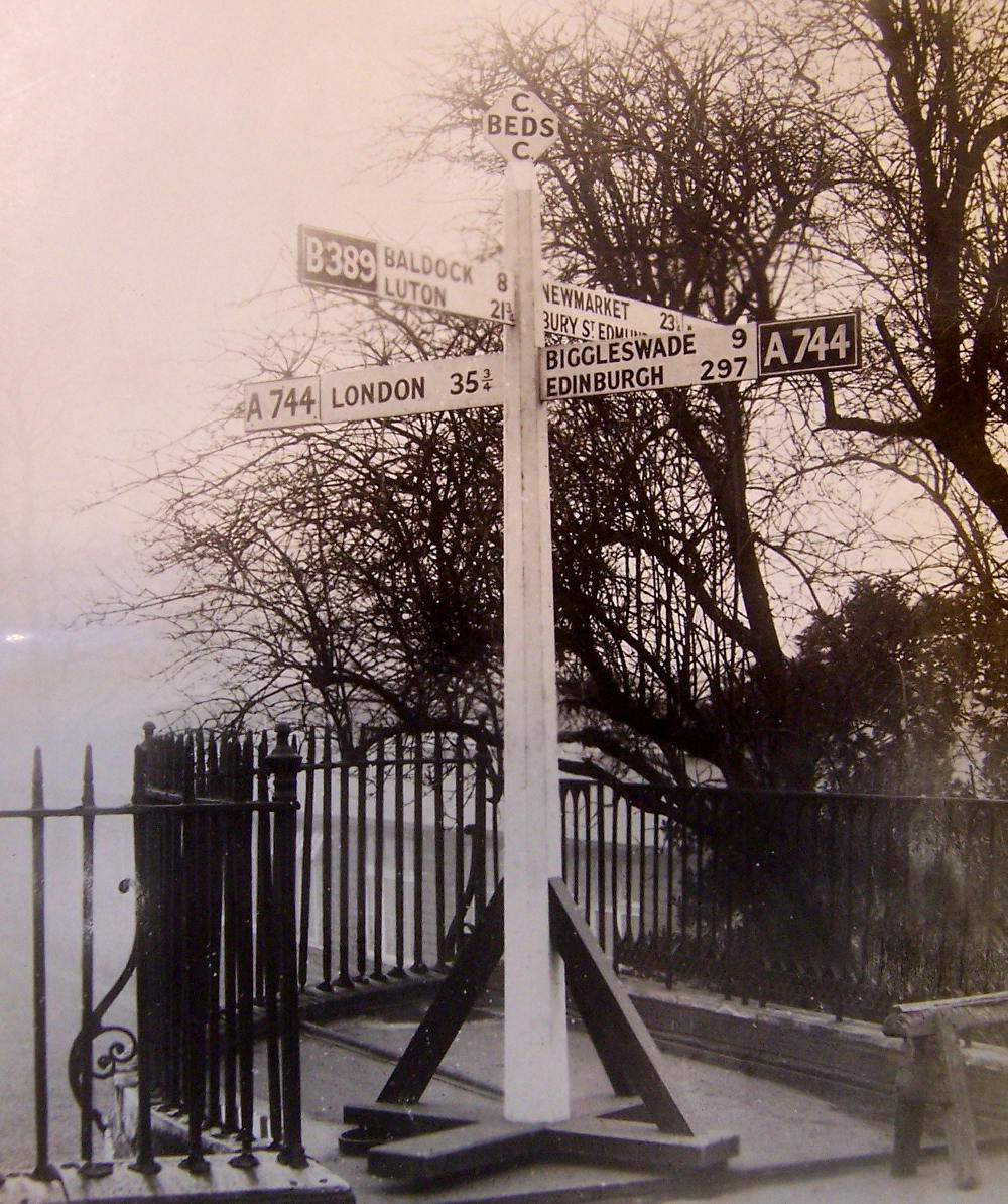
There was, finally, a new rule that could not have existed before, referring to the Ministry's brand new route numbers: first class routes would have their number in black on white, preceded by the letter A; second class routes would have their number in white on black, preceded by the letter B. The concept of letter prefixes was so new and unusual that some designs accompanying the report showed just the number alone with no A or B.
You are here
Maybury's report did one last thing that was entirely new, creating a type of sign that had not existed before and is still with us today. For centuries fingerposts had stood at important junctions gesturing towards distant towns and villages, but on arriving at the next place along the road it could often be difficult to know where you were.
"It would be a great convenience to the travelling public if notices were erected on the main approaches to towns and villages, giving the name of the town or village. These name plates are recommended for adoption, where necessary. The plate can also conveniently carry the route number of the road upon which it is erected and the name of the County Council or County Borough Council."
No particular design for these name plates was suggested, but illustrations accompanying the report included a drawing of one with a hexagonal sign face, and in the years that followed it would be adopted as the standard type for signs like this in many parts of the country.
The fight for fingerposts
In late 1920, the Ministry of Transport had existed for less than two years and was still exploring the limits of its new powers. Henry Maybury had come to the Ministry from the Army, so he found himself Director General of a prestigious new organisation with no previous experience of government business; Eric Campbell Geddes had a military background of a different sort, having been drafted into public service by David Lloyd George during the First World War to invigorate the production and transport of munitions.
Together, the two men sometimes applied more brute force than was strictly necessary in their new and relatively genteel surroundings. So it was that Maybury proposed new legislation that would make the approved signs compulsory, and — even more ruthlessly — that "all other signs not complying with the approved designs should be removed".
This attempt to force the new signs upon counties and boroughs met its match in William Joynson-Hicks, occasionally remembered today as the man who booted Winston Churchill out of Parliament in a by-election and for holding such authoritarian and right-wing views that he earned the nickname "Mussolini Minor". He was also a founding member of the AA and variously chairman of the Parliamentary Road Transport Committee, the Motor Union's Legislation Committee and the Society of Motor Manufacturers and Traders. His background made him an expert in motoring law. In all that he did, he was a force to be reckoned with, nowhere more so than on the roads.
Joynson-Hicks took exception to the idea that the Ministry might force highway authorities to use its new signs by law, and that all other signs would be removed, no matter how interesting, useful or historic. He saw no reason for the Ministry to throw its weight around in this way, and disagreed with the implication that the new signs were such a great improvement that they must immediately replace all others. He took exception to a great deal else, too, speaking at extraordinary length in Parliament on all matters relating to the Road Fund, and was evidently something of a thorn in the new Ministry's side. But on this issue he represented a considerable weight of opinion.
The backlash to this idea led Maybury to suggest instead issuing a notice to all highway authorities "strongly recommending" they adopt the new designs. From this unsatisfactory compromise came the eventual answer: when classification was completed, the Ministry would begin allocating funding to authorities for the roads they looked after. It would then only pay for new road signs if they conformed to the new designs.
From that moment they ensured almost total compliance without having to mess about with legislation at all — and perhaps more importantly, without crossing the formidable Joynson-Hicks and his followers.
A lasting standard
The signs recommended in the Ministry's 1920 report were adopted across almost the whole of the country, but were replaced little more than a decade later by newer and more modern designs: new direction signs with map-type layouts, new warning signs and symbols, new speed limit signs with the numbers inside the red ring and more. The pace of change on the roads meant that signs conceived shortly after the First World War soon became obsolete.

While the designs might soon have been replaced, it would be a mistake to think the report had no impact. In fact, it shaped the system of road signs for well over forty years, and warning signs with a hollow triangle and symbol beneath would persist until 1964, when they were replaced with the designs we use today.
It also — perhaps even more importantly — established the concept that standardised, uniform road signs nationwide could make a contribution to road safety. By the time the next set of designs were drawn up, legal powers were published to accompany them. Today, contrary to the wishes of William Joynson-Hicks, official road sign designs are mandatory and highway authorities are required to use them by law.
Road enthusiasts and historians today find it difficult to track down road signs that pre-date the introduction of the modern Worboys system in 1964 — even examples from the early 1960s are hard to come by. It almost goes without saying that signs produced to Maybury's specifications, published in 1920 and superceded little more than a decade later, are almost non-existent, and it's rather sad to think that the signs described in this article, that established for the first time a uniform system to provide information to motorists, are now ancient history.

A few do exist though — and ironically, the most numerous are actually the ones that the report specified in the least detail: Maybury's "name plates", shown in the report with a hexagonal sign face, can still be seen in a handful of rural locations in England. There are at least two in Norfolk, and one more is incongruously located on a sliproad just off the A1 in Nottinghamshire.
For as long as those signs exist, the work of the Ministry of Transport to develop a modern highway network, carried out in its very earliest days, lives on.
Sources
- Memorandum on Road Signs and Direction Posts, Sir Henry Maybury, 30/11/1920, available from the National Archives at MT 49/122.
- Sir Henry Maybury: biography.
- Eric Campbell Geddes: biography.
- William Joynson-Hicks: biography; motoring interests: The Commercial Motor, "Motor Vehicle Interests in Parliament", 20/02/1919.
Picture credits
- Diagrams of 1920s report sign specifications and photographs of prototype signs extracted from MT 49/122 at the National Archives.
- Photograph of Sir Henry Maybury by Bassano Ltd. © National Portrait Gallery, London.
- "Dangerous Corner" sign at Carisbrooke Castle taken by Ray Harrington and used with permission.
- Photograph of William Joynson-Hicks, 1st Viscount Brentford by Bassano Ltd. © National Portrait Gallery, London.
- Photograph of name plate sign at Cromwell by Richard Croft and used under this Creative Commons licence.