It's not easy to design a road sign. There are whole books of official guidance on the subject. You have to know a wealth of information to get the right colours, designs, layouts, spacing of text, kerning, tracking and weighting of letters. You need to make sure the radius of curves is correct when compared to the stroke width and letter height. You need to be able to work out when patches are needed and when you're allowed to use a flag or a stack-type sign.
Most of the time the resulting sign is correct, and when British road signs are made properly, they can be great pieces of graphic design work.
Unfortunately it doesn't always go right — whether it's bad design or just a lack of proof reading. Sometimes it's the right sign in the wrong place. This gallery documents some truly terrible mistakes on road signs past and present.
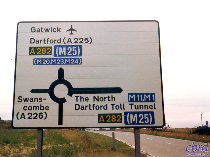
This sign, erected in the 1980s at Dartford, made the inexplicable mistake of pointing to the M24. There is no M24, and both the M20 and M23 are already shown. What on earth was it getting at? Paul Taylor was Resident Engineer on the project, and had the error overplated very quickly indeed!
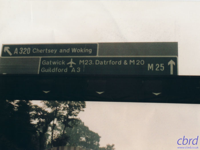
In 1980, shortly before the M25 J11-12 was opened to traffic, Mr GH Spencer took this picture of a sign pointing to "Datrford". It was almost certainly fixed before the road opened to traffic.
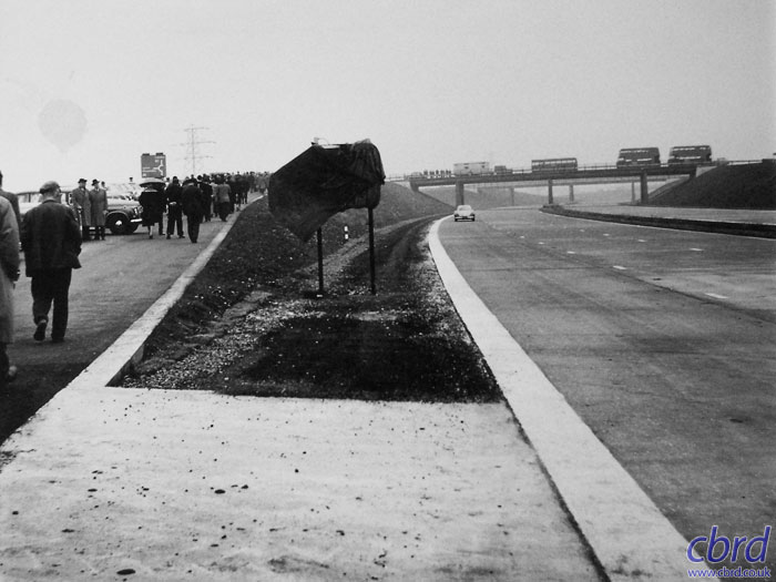
November 1959 at the opening ceremony for the first section of the M1. A cloth has been thrown over this embarassing faux pas. The southbound diverge sign at junction 10 has been placed in the hard shoulder. Oops!
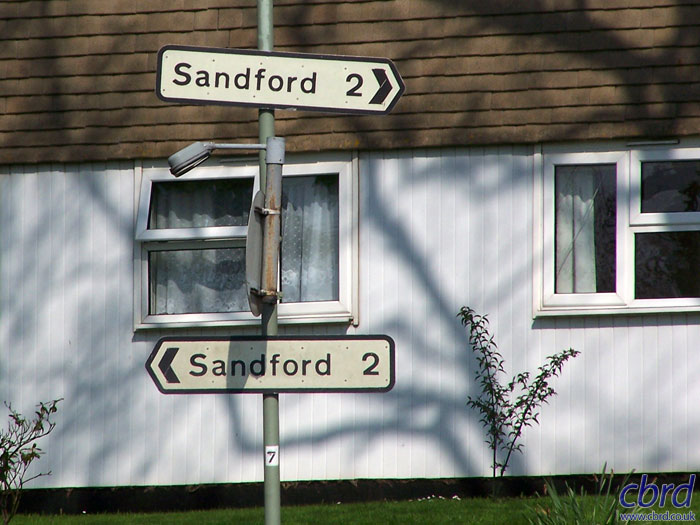
In Devon, all roads lead to Sandford... This pair of wrong-way signs were spotted in Crediton by Colin Price.
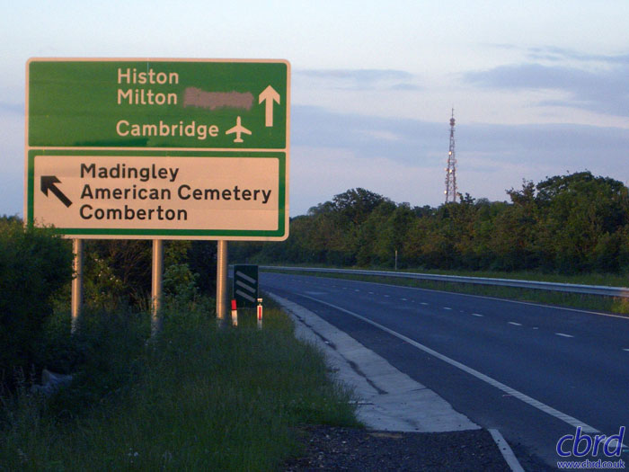
This sign was erected on the A428 during some upgrade works. It's supposed to be pointing to Histon and Milton, but whoever designed it put Milton Keynes instead. It was painted over before the road was opened. Photo by Clive.
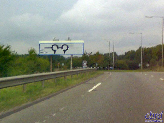
Ken Hodierne took this photo on the northbound off-slip from the A46 at M6 J2. He writes: "My children were in the car, and when they saw the sign one said '...is that sign to tell Mickey Mouse to turn left?' When you look at it, it looks like Mickey Mouse ears, so ever since it has been known to us as Mickey Mouse Island."