In 1958, the Ministry of Transport was kicked into action over road signing. Something had to be done because Britain's first motorway, the Preston Bypass, was due to open in just a few months. It was clear from the outset that the signs in the latest regulations would not be adequate for motorway traffic.
The Anderson Committee
The need for new signs was met by the formation in 1957 of a Committee under Colin Anderson, chairman of P&O, which quickly began work on developing a set of designs for motorway signing, though it didn't report in time for the opening of the Preston Bypass. The motorway was used for some time as a test bed for the draft designs that the Committee came up with. These designs were very much influenced by practices in Germany and the USA, both of which had substantial lengths of motorway, and at one point considered adopting the typeface used by the US. James Drake, instrumental in the building of the Preston Bypass, was known to advocate the use of fork-style signs as used in Germany.

The final recommendations of the Committee were for a white-on-blue colour scheme, extensive use of diagrams on signs (particularly for the standard exit 'fork' sign), and new typefaces, which had been developed specially for motorway signing by Jock Kinneir and Margaret Calvert. The principal new font was a modification of the established sans-serif font Aksidenz Grotesk.
One of the crucial decisions of the Anderson Committee was to use mixed-case lettering instead of the standard uppercase. The decision was partly because lower-case was more fashionable in communications design at the time, and partly because mixed-case lettering was also being used on the most thoroughly researched traffic signing systems in the USA and Germany. The evidence for the relative legibility of all-uppercase against mixed-case lettering on signs is rather mixed to this day. The conservative view, arrived at when the California Division of Highways tested an experimental traffic sign typeface in Los Angeles (which eventually developed into Series E Modified/Lowercase, the typeface used on modern American freeway guide signs), was that mixed-case lettering made slightly more efficient use of sign area than all-uppercase lettering.
David Kindersley
After the Anderson Committee reported its findings, the Ministry of Transport was happy to go ahead with the recommendations, and signs conforming to the new standards started to appear on motorways.
Not everybody was happy with the decision. In particular, a graphic designer called David Kindersley and his accomplice Brooke Crutchley, the University Printer for Cambridge, waged war on the new designs. In the late 1950's they started kicking up a very public fuss, with letters printed in the Times and a debate between themselves and members of the Anderson Committee that was broadcast by the BBC.
Kindersley made two principal criticisms of the new signs. The first was that Anderson Committee signs were too big ("signs as big as houses") and that the same information could be presented just as effectively on much smaller signs. The second concerned the choice of mixed-case lettering on the signs, as Kindersley and Crutchley believed that uppercase was more legible at distance, and in particular that there was greater scope to modify uppercase letters to improve their legibility than there was to do the same for lowercase.

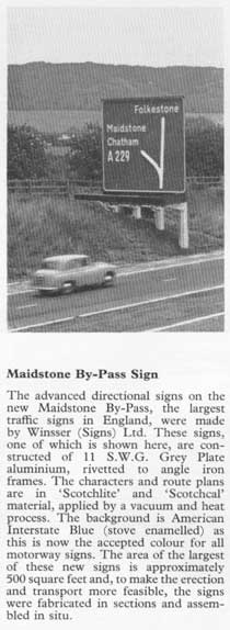
To demonstrate their points, the pair took the advance direction sign for the Park Street Roundabout at the end of the M10, which was one of those diagrammed as an example by the Anderson Committee, and produced a new version to their own designs, which had just half the surface area of the original and used an all-uppercase font of Kindersley's own design. Kindersley managed to corner Ernest Marples, the Minister for Transport, at a society function and very nearly got him to agree to install the test sign on the road. The sign was not, in the end, installed because senior civil servants in the Ministry intervened and persuaded both parties that permission had never been granted for the experiment.

When the Ministry asked the Road Research Laboratory to do a literary review of Kindersley's sources, it came to light that his evidence was, at points, questionable. He cited a paper produced by the California Division of Highways that examined the merits of uppercase and mixed case text on signs, and used it as evidence that uppercase lettering was preferable. In actual fact the paper resulted in the use of mixed-case lettering on Californian freeway signs, and was the report mentioned above that was part of the Anderson Committee's case for using mixed case lettering.
In addition, the Road Research Laboratory carried out its own tests to compare the legibility of MOT Serif (the all-capitals font in use in the 1955 regulations) and Transport Medium (the new mixed-case Anderson font), and found that MOT Serif had a 3% advantage, but only if there was extremely narrow spacing between lines of text and between the text and sign edge. The advantage was eliminated where the text did not take up most of the sign, which was the case on Anderson designs. While the results of this research could have been used to justify all-capitals lettering if the area of signs was drastically reduced - as Kindersley recommended - the Ministry wanted its signs to remain large. The better 'target value' of large signs was valuable to motorists, and in addition, separate research showed that motorists made fewer errors where junctions were explained through use of diagrams.
Kindersley's argument was not altogether disproved, but nonetheless, the Ministry decided to continue using Anderson Committee designs.
Guy Bettley-Cooke adds the following information:
I worked with David Kindersley for 3-years & completed a catalogue of his mainly inscriptional work. He was, of course, the best-known former apprentice of the sculptor & typographer Eric Gill, of 'Gill Sans' fame. With regards to lettering for signs, Kindersley had previously re-drawn the 'Standard MOT' alphabet, to give it greater legibility and also devised a spacing-system to stop over-close spacing of the letters.
In 1950, the MOT bought his streetnameplate alphabet, calling it 'Kindersley', which is still to be seen in use today. (It has a very Trajan-inspired R). Having been in touch with one of the RRL testers of the 'MOTSerif' alphabet, it seems that there was political pressure to go for a "European" alphabet on the new motorway signs. The UK was used to all-capital direction signs and it has been said that this was retained as a ploy to confuse any invading Germans who were, of course, used to Lower-case lettering on their signs!
Several small-scale trials using 'MOTSerif' signs in real locations were carried out, in rural Cambridgeshire and the centre of Chichester, in Sussex. The CPRE supported Kindersley's contention that smaller signs were better in the landscape and later supported the use of 'MOTSerif' for Village Namesigns...to no avail. A lower-case alphabet to match the 'MOTSerif' capitals was later produced, but little seems to have been done with it, although I believe the Australians possibly expressed an interest in it for their roads.