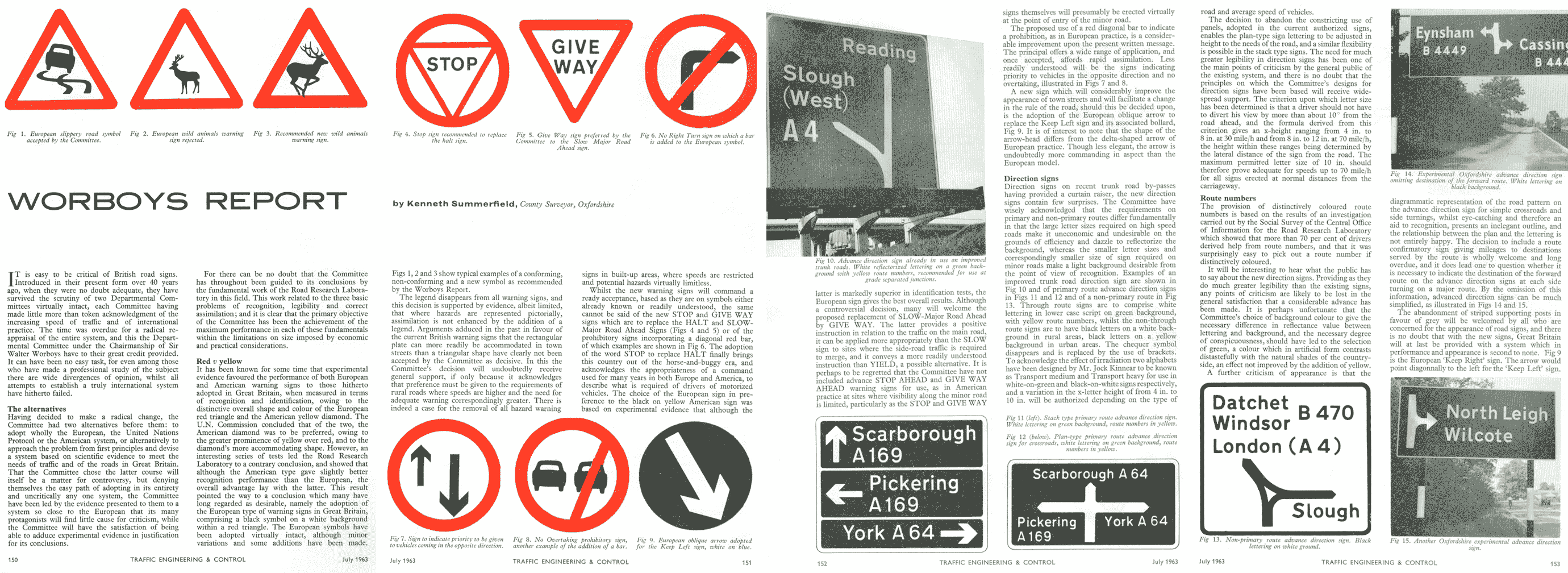
The final report of the Worboys Committee detailed a set of traffic signs that was an enormous improvement over its predecessor. It received widespread congratulations from the press, industry and motorists themselves. Britain now, at last, conformed to European standards and the Vienna Convention, and made full use of the technology now available to make large, detailed and colourful signs.

For the first time it was possible, without having to simply write the message in capital letters on a plain black-and-white sign, to warn drivers of a cul-de-sac, to instruct them to keep left and to prevent them from parking in a given location. A grasp of English was no longer required to understand the symbol for a narrowing road, and the urgency of having to STOP was no longer lost in the wordy instruction to "halt at major road ahead".
A major review of the direction signing system conducted in the late 1980s found effectively no problems with the Worboys system - it could only recommend the introduction of white-on-brown tourist signing and a few other minor changes. Worboys was a world leader in good signing practice.
After the Worboys Committee made its final report in 1964, there was a period of mutual back patting. Articles appeared in industry journals celebrating the new sign set, the BBC conducted interviews with Ministers, and all was well.
However, it was realised that the signing system was still not in line. The tables had been turned: now the growing motorway network had a system of signs based on old research.
As a result, the Ministry re-designed the Anderson signs to fit the new Worboys template, straightening the 'wonky' arrows, adjusting the spacing and as a result making them slightly smaller after all. The warning signs changed to standard Worboys white triangles with red borders; off-motorway signing stopped being all blue. Finally, the new Worboys signs and the revised motorway ones were compiled into the new Traffic Sign Regulations and General Directions (TSRGD) and passed on to Parliament for approval.
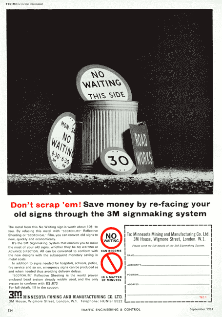
For a while some sign manufacturers promoted low-cost ways of converting signs to the new Worboys designs; one offered a free consultation service to confused Council highway departments. Eventually the signs started appearing across the country.
Since 1964, the acclaimed system has been tweaked several times, but no need has ever been identified to change anything on a large scale. Blue borders have narrowed, and then disappeared; brown signs have popped up; new warning signs have emerged and old warning signs have had their symbols altered, and the stop sign has grown eight new corners. But most things remain the same.
Since its adoption, the Transport font has been called the handwriting of Britain. It has been adopted or adapted for Spanish, Icelandic, Portuguese (who also use the Motorway font) and Italian road signs, and from the Worboys report, everything from colour coding and design rules to exact pictogram designs have been borrowed and put into use somewhere else. The result of many years of experimentation and careful planning and design is a system of signposting that remains essentially the same forty years later, and is still met with much acclaim.